
You must log in or # to comment.
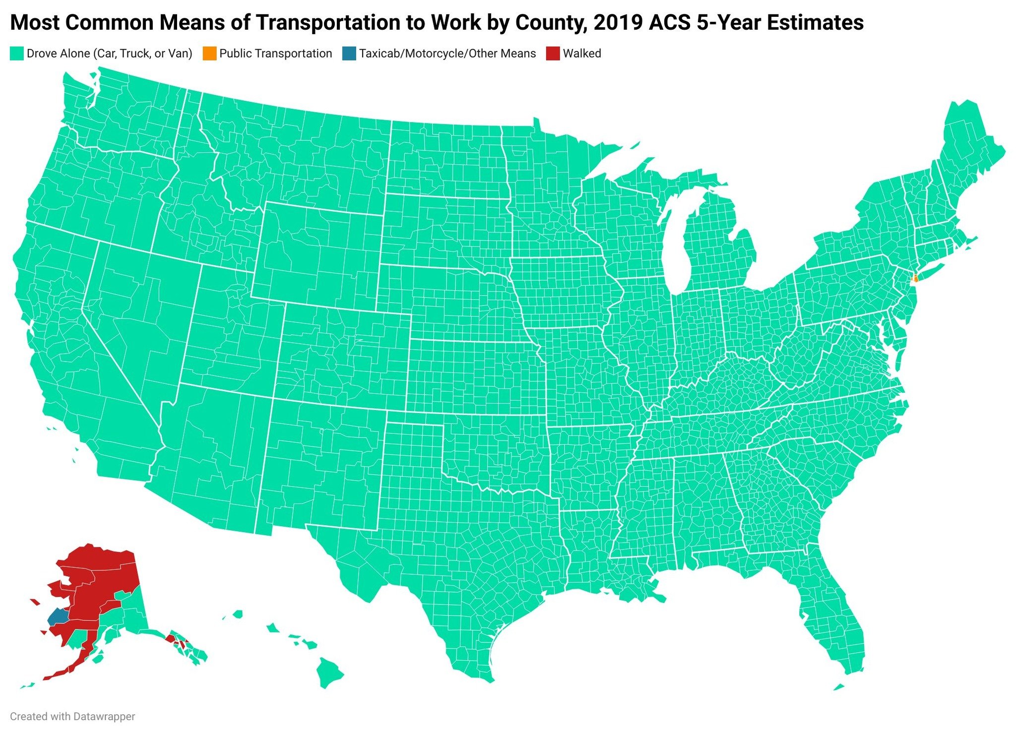
Another demonstration of how NYC is the only real city in America and anywhere else is a suburb larping as a metropolis.
You can’t call yourself a metropolis unless half the population uses public transit: change my view.
50% of Boston’s workforce commutes using the T every day, but it doesn’t show up on the map. I’m assuming because most of those stops are in outlying towns and, therefore, only make up a minority of the commuting workforce in each area. According to the federal government, the T is the third best public transit system in the US due to it being the fastest average commute out of any by at least half an hour, only outclassed by the quality of DC and Seattle (I believe, might be Portland that’s #1? I’d have to look again).
Are there similar maps available for other countries? Would be really intereseting to see
(source)
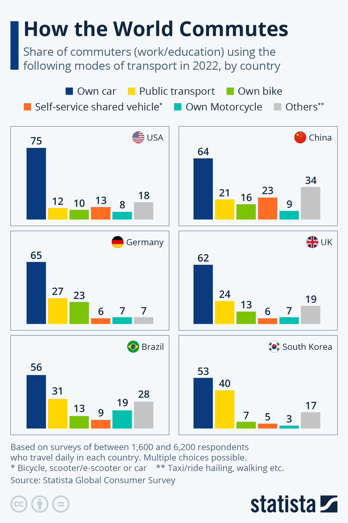
Not a map, but at least some more data from some other countries. The own car is unfortunately the most used mode of transport for commuting in every surveyed country, but the US seem to be especially far behind when it comes to alternatives.