Where can one find a good (pretty) interactive web map with this?
EDIT: Apparently it’s from equal-earth.com 2018 but it got hugged to death
Even Russia’s like: sure don’t care.
you must be kidding

And of course, nobody is surprised.
I’m more surprised that Russia voted Yes
Russia’s been cozying up to Africa for a long time. And it was the AU which spearheaded this initiative.
Since Russia is actually very large, they’re probably thinking they’ll look even bigger than they already do!
Russia doesn’t care because they’re big as fuck on any projection.
So is the US, but we voted no because we’re contrarian little pissbabies.
Guess they will soon not only have their own system of measuring distance, weight and temperature; but also their own system of displaying Earth. They want to live in their own version of reality i guess.
When were the United States is bigger than Russia.
Pardon?
When wereone where
“Nooo, don’t change the mirror to one that reflects things accurately! I like this one better because it makes me look taller, more muscular, and better-endowed!”
It isn’t more accurate than Mercator, it just preserves different features.
When flattening a map, there are 4 competing aspects of the globe you can try to preserve: shape, direction, area, and distance. You can’t preserve all 4 at once. You can try to min-max on 1 or 2 (e.g. Mercator preserves direction and shape since that’s what’s needed for sailing), or you can accept some distortions of all 4 in a compromise projection.
It all depends on the purpose of the map.
Abstentions are also no
Abstentions means let the others decide.
Abstentions are explicitly neither yes nor no.
I hate this fucking country
Who doesn’t?
Lmao the fucking irony:
The US, which voted against the resolution, slammed the text as an ideological exercise that it said undermined the UN’s credibility.
“This initiative is presented as an anodyne effort to update cartographic proportions,” said Mike Waltz, the US ambassador to the UN. “The United States clearly sees it cannot be separated from the much larger and more radical ideological project it belongs to.”
I can’t make heads or tails of what point this word salad is actually intending to convey. It sounds like a toddler trying to argue because hes afraid try a new food on his plate.
Sometimes people with really stupid beliefs will dance around saying it clearly because on some level they know how stupid it sounds.
Wow, the US government is so paranoid, because how the fuck in your right mind can you find a reason to think “everyone’s out to get me” because others want to edit a map? It’s also funny how they never specify what this “radical ideology” is, despite constantly complaining about it like a child would about their mother not getting them an ice cream.
Editing maps is only allowed for one person, as we all know /s
The radical ideology is called the truth and America hates it. It undermines their precious lies.
Not even Israel voted with the US this time. Take this opportunity for reflection.
It’s because they don’t want the world to see it getting bigger as it starts annexing its neighbors’ land.
The new map projection makes land close to equator bigger and land closer to the north and south poles smaller.
Anyone who is not living under a rock knows what is happening and those who still approve genocide don’t give damn they are getting bigger.
The title:
Today, the United Nations voted to adopt a new world map that reflects countries’ true relative sizes
Haters, probably:
let’s still make this about us hating Israel - in comparison to how we hate the US
GJ for the UN. I hope it’ll make good progress in the long run for all of us. More accurate representation of the world - for more adequate and fair decisions and actions.
It’s a common pattern for the General Assembly that essentially all of the world votes together, and then the United States, Israel plus some tiny island nations votes together. This vote struck me as deviating from that pattern because the United States literally stands alone on this issue. Even the number of Abstentions is unusually low.
Ok, thanks for opening the prev.comment a bit more!
It is curious, indeed. 🖐️
My one question is why
Because they’re chauvinists on the way to fascism
Lmao “on the way”.
Biggest is best?
They wanted to rename Africa to New America.
This might be the first time in history Israel voted differently than the United States of America
Does it say which projection they’re actually going to use?
According to this Guardian article:
the UN general assembly officially retired the 16th-century Mercator projection in favour of one based on the more accurate 2018 Equal Earth design
UN resolutions are non-enforceable, so I’m sure countries will implement it in different ways (some may not implement it at all). France has already said they will be using Eckert IV which is close to Equal Earth:

Eckert and Equal Earth are fine, but I much prefer Peirce Quincuncial as more representative of the globe. All of the land distortion is minimal and equal, and it’s tileable to get a better image of distance across hemispheres
Remember, the idea is to use this maps for teaching, the Peirce one would simply prevent people from actually learning about the world. I don’t say it cannot be useful in some contexts, but for human readability is shit.
How would it prevent learning about the world?
Because it is very hard to visualize correctly, when I look at it I need time to even understand what I am looking at. You can blame it on the fact that we used Mercator for centuries, but this does not feel natural. The one selected keeps proportions while feeling natural to almost everyone alive today. Maybe I am wrong about learning, maybe if everyone learns with this it would make sense, but this is the type of thing in which you have to compromise, no one alive (of course there are exceptions, but you know what I mean) prefers to look at yours instead of a map focused on the Ecuador/Atlantic.
Here’s a map with political borders, capitols, and large cities
I am not saying it is not a good map, I just don’t think it is the right representation. Think about it, what picture do you think shows you better? One from the top? Or one from the front? Both show you, both miss information, but still one gives you way more to work with than the other. Looking at things from “above” is not natural for humans.
But you completely discard the very concept of direction. And look at poor New Zealand.
I don’t think so, I think it accurately portrays what North is on our globe. Magnetic North is in the Arctic. By displaying the Earth this way, we’re seeing a map that’s oriented to the North.
The issue with New Zealand goes away with tessellation. This is from Wikipedia, I think that we should be tessellating around the the first part of the map instead but it gets the point across

What a trippy representation of the world! I love it!
Waterman butterfly
Mercator is bad as a world map, but the reason why it’s used on most online maps is that those online maps are usually used as local maps, where Mercator is a very good projection. It would be good if online maps switched projections if you zoomed out beyond a certain level.
A maps (probably one of the most widely used digital maps, whether you like it or not) switches to a spherical projection as you zoom out. I’m actually surprised google maps doesn’t do the same.
Don’t they? At least Google Maps has for a while.
Maybe, idk, I rarely use anything not based on OpenStreetMap. 😛
The web maps I create I use different projection systems for different zoom levels. Mercator is the best we got globally, that’s why it’s lasted since the 1540’s. Usually as you get closer you should be using a state plane PCS. It’s not survey level of course but most maps are based on close enough unless it’s a survey map done by a licensed professional.
You make maps? I’ve been looking for halfway decent maps.
But they all look like hot garbage on a purely aesthetic level. Maybe that is entirely subjective, but the best world map (that can be switched to 3D too) is this ArcGIS NatGEO one. Other maps also have problems like showing names of countries and cities in their original, completely indecipherable language making them useless. I’d absolutely love some kind of open streetmap based PRETTY world map in English and that can switch different projections. And show things like the fucking equator. I mean how hard can THAT be? But every time I want to look at a map or globe I have to wait for the images to download for the 100th time instead of being cached because there is no (open source) map app for windows.
Yeah I’m a GIS specialist I make maps both on the computer using a spatial database or web maps that are viewable to the public. You would have to use QGIS since ARC GIS is expensive as hell. But you could probably put together something similar to what you’re discussing here. Let me see if I can find something similar to what you’re talking about but most of the time we make maps to show things. You’re basically wanting just a base map which you can probably make yourself on mapbox.com and import it into qgis make labels English.
Feels like a fun math challenge to seamlessly convert between map projections based on zoom level.
Not on iOS anymore but when you zoomed out on Apple Maps it became a globe. Not sure if that’s still true or I remember incorrectly and am confused with a 3rd party map, but that would be best on screens imo.
Just checked. Apple Maps still zooms out into the globe on iOS
Nice, i didn’t like Apple Maps for navigation but i did really appreciate the design of things. They had 3d maps quite early in the city I live in and I really liked that too. Props to Apple for that.
Google Maps zooms out to Mars.
Why? I don’t know.
Google does a ton of things that are kinda cool but mostly pointless and then they stop supporting it randomly.
Good but tbh I feel the modified Dymaxion map would’ve been the best choice if only displaying land; or the Waterman butterfly.
If also water, then Tobler hyperelliptical., or Aitoff.
See here for a full list of map projections. I also like the Hao projection on there, but yeah.
I’m just grateful they didn’t go with the Gall-Peters, which often seems to be the favorite alternative, but always feels to me like it distorts almost every country.
Yeah, thankfully they went with a balanced projection. G-P makes my sub arctic island look like someone stepped on it. And Africa looks like Antarctica is trying to pull it apart.
For world maps I’d have picked one that projects onto some sort of ellipsoid.
Edit: Ah, they did. The only image I’d seen showed another projection.
Tickled that the article’s default image is cropped and removes New Zealand.
But fear not, the full version of the map in the article body has New Zealand.
I feel like these projections make Antartica looks significantly larger than it reality. Is this thought correct?
I mean, do not underestimate the size of Antarctica. It has the area of about two Australias (14.2 vs. 7.6 Mio. km²), and it’s only somewhat smaller than South America (17.8 Mio. km²).
It does always look a bit larger as well, though, simply because it is unrolled at the bottom there.(We’re not gonna talk about Mercator, where it does look comically big…)
For the proper size, you’ll have to look at a globe.
Wikipedia has little preview globes:- Antarctica: https://en.wikipedia.org/wiki/Antarctica
- Australia for comparison: https://en.wikipedia.org/wiki/Australia
This webpage is also not too terrible for a 3D globe: https://www.webglearth.com/
The United States cast the sole vote against, dismissing the initiative as part of a “radical ideological project.”
In other words, the reasons and explanations were too difficult for the American envoy to grasp.
I saw the US was against it an thought it had to be smth like this. Only americans can look at a problem like “you can’t project a 3D sphere onto a 2D plane” and think “waow this is a little too political for me” (I know I’m oversimplifying but u get the gist)
“radical” lost all meaning in the US
It has. I am just hoping that once cheeto man is out of office that life in the US can progress back to something more recognizable again.
You need to flush the system of all his acolytes too.
Why the us voted against? In the new map they look bigger than Canada, it should appease the baby in command.
They don’t want Trump to see how small Greenland actually is. I think he reckons it’s about half the size of the United States because he’s an idiot. Not that this map projection is at all new, or has been a secret or anything, but trump isn’t exactly the investigating type and so he probably hasn’t seen it before, but if the information is shoved in his face he might become upset.
The Equal Earth projection, the one they voted for, kinda sucks IMO. It vertically stretches every country in order to make sure everyone gets equal area, but it’s trading horizontal area for vertical area. Robinson is better.
the UN, fighting the important fights /s
The fuck? Why wouldn’t the US want the actual sizes. Wouldn’t having geographically correct maps help the planet and the people, oh wait… The US government hates that kind of shit
Mercator is great for navigation in straight lines and makes countries far from the equator look big
The navigation thing is an actual advantage but it doesn’t give you the shortest routes, just the easiest to follow
Because Mercator projection makes the USA look bigger.
Because we worship ignorance here.
WOW. I did NOT know Africa was so long, America so small, and India so thin…
Every projection deforms either size ot shape. The projection that this resolution proposes stretches everything vertically (but preserves the sizes). You can see it by looking at intersections between meridians and circles. The spaces between them are supposed to be closer to squares.
India used to be a long thin Island and then it smashed into the rest of the continent to the North and sort of smushed out on the northern’s edge. Eventually it will be completely flattened against the uppercontinent.
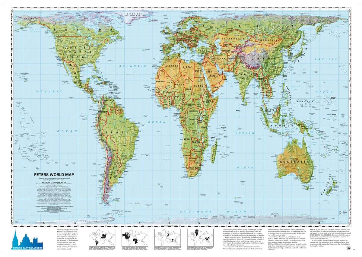
The Organization of Cartographers for Social Equality was a group of map-makers who favored the adoption of an inverted Peters Projection map as mandatory for all education within the United States. They felt strongly that traditional Mercator maps gave undue focus on the nations and peoples of the Northern Hemisphere.
https://westwing.fandom.com/wiki/Organization_of_Cartographers_for_Social_Equality
Gotta admit, the old map looked more aesthetic.
Thankfully that isn’t the new UN map. This one is.

Dumbass United Stat…
Americans are probably the dumbest people on the planet.
Source: been here my whole life
NOT TRUE. there’s those stupid short folk on the falklands with the webbed feet and the orange noses, what smell awful and like bad fish who dress formal everywhere. they’re pretty silly
There’s plenty dumber, trust me, but Americans are proudest of their dumbness