

Alt text:
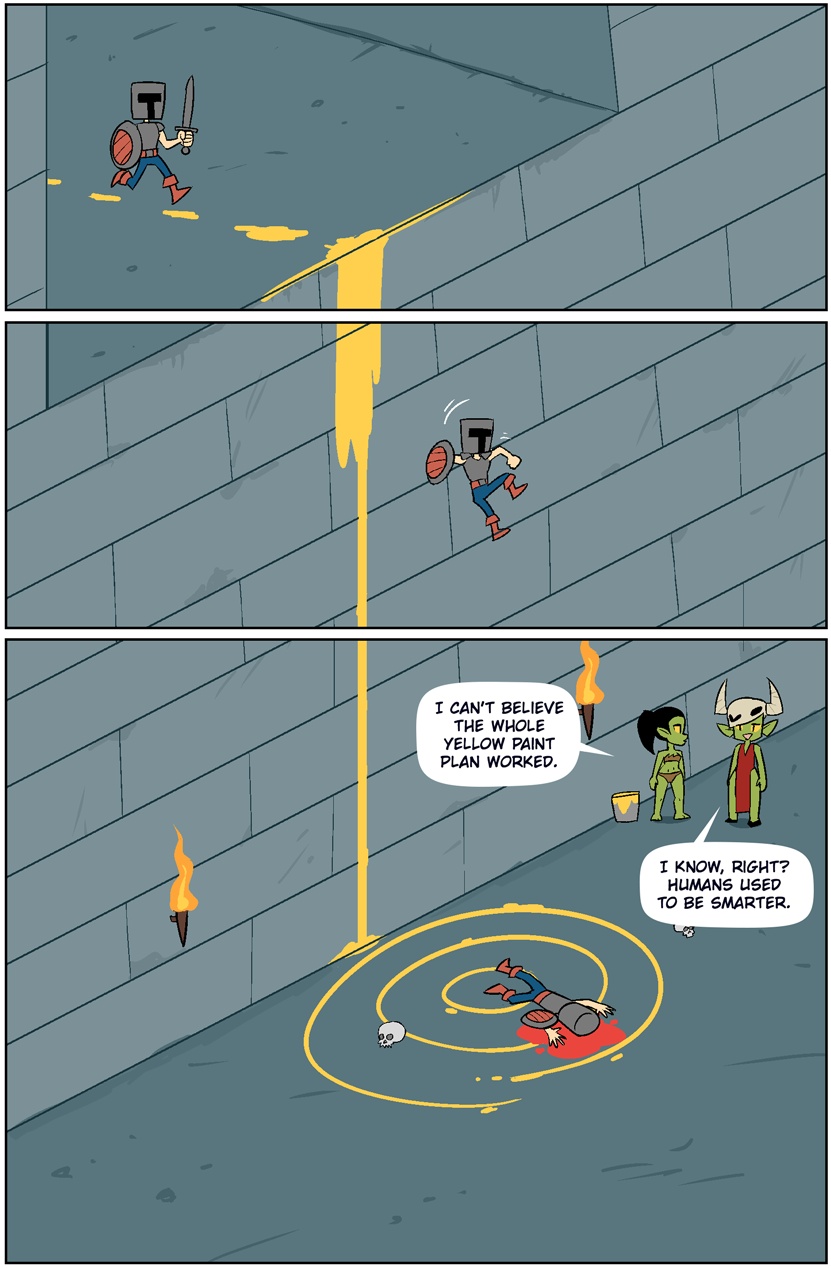
I don’t mind yellow paint as much as it is a sign of the broader issue of big games trying to be idiot-proof. If a game has yellow paint I expect it to be as easy as it can be outside of giving me literal god mode.
Abiotic Factor had a sentient yellow paint can that had very clearly marked the correct path in an open map. You never meet the can, but there is yellow paint thrown all over the place in some areas, but it also marks a few entrances. Is yellow paint a common trope? I had no idea it had a deeper reference.
A glowing yellow trail that you follow is common in many RPGs now
I can’t believe it bothers me as much as it does, but…
WTF happened to the sword? It disappears after panel 1
Cartoonist had to be OSHA compliant.
Dungeons and Dragons and OSHA inspectors, oh my!
They swallow it for safe keeping during the jump
Gulp…
I’d like to make a game where it’s your job to use yellow paint to show the hero where to go. You’d have to predict how the level would crumble during the chase sequence. If you did everything correctly you’d get a AAA rating.
Your overall goal is to suck the player’s intelligence up or so.
lol. Love it. You get to make the Hard Mode level into Easy Mode for the user. That would be a fun game.
so a game where you become The Stanley Parable Adventure Line™
yes
That game came to mind first when I saw the comic
Very fitting ending for this discussion too, as I think its message was something like “our destination is wherever we end up” (with Stanley and the narrator making up their own story, with no regards to what the game™ had planned for them).
It was also called the confusion ending :)
quote
“Wouldn’t wherever we end up be our destination, even if there’s no story there? Or, put in another way, is a story with no destination still a story? Simply by the act of moving forward, are we implying a story such that a destination is inevitably conjured into being via the very manifestation of life itself—”
“So we know that each door has to lead somewhere, which means that somewhere at the place where we’re trying to go, there must be a reverse door that leads here! And that in turn means that our destination corresponds with the counter-inverted reverse door’s origin. So, starting from the right, let us ask – will taking the right door lead us to where we’re going? And since the answer is clearly yes, that means the door on the right must be the correct one. Another victory for logic. Onwards, Stanley! To destiny!”
I love these quotes.
That genre is very popular already m8.
Seems like you need to play more strategy games.
I think you’re basically talking a modern lemmings or warios woods, and I would totally play it. That AAA rating is so clever haha.
You should play Doorkickers.
I have no idea what this yellow paint in games thing is. Never seen it in any game ever.
There’s been arguments online regarding accessible game design and the inclusion of yellow paint as an identifier.
If it is toggleable, I see no issue with this whole thing.
Look at any of the recent Resident Evil games. Intractables, such as breakable boxes or shootable object will be marked in yellow
Some other people have listed some, I’ve seen it in tomb raider, uncharted, dishonored. It’s used in Star Wars, assassins creed, it takes two, split fiction, and tons more.
I remember seeing it it Mad Max:

For the record, the game is great and the paint there never bothered me. I consider it an acceptable break from reality, much like medkits and not wasting ammo when reloading a half-empty clip.
Sometime in the PS3 era, graphics got so realistic that…
Let’s back up a second. Go play Ocarina of Time. OoT has wall climbing mechanics, but Link can’t just climb any wall, it has to be a climbable wall, and that is denoted by a different texture. Most commonly vines, but there’s a ladder-like texture on a wall on Death Mountain and rough brick in the Spirit Temple. And one wall in a Skulltula nook that isn’t textured, but Link can climb it anyway.
The 3D environments on the N64 were pretty rudimentary; big chunky rectangles. A couple generations of console later, you get pretty realistically noisy environments. And you’ll have the exterior of a building or a pile of debris or some other set piece that has a single intended climbable path. Where older games would just…lay out a weirdly rectangular patch of climbing vines, now your character is supposed to climb pipes, ledges, window sills etc.
Not everywhere in the world is climbable, so they started tinting actually climbable surfaces a distinctive color, often yellow, sometimes white. The new Tomb Raider games do this, later Final Fantasy games do this, Horizon Zero Dawn/Forbidden West do it, etc.
The biggest extreme is Mirror’s Edge. The game’s primary mechanic is parkour, so the “paint climbable edges yellow” technique is elevated to the game’s whole aesthetic; the environment is stark white with parkourable elements tinted bright red. Looks cool and stylized while also allowing the player to process the visual information fast enough for a parkour game.
‘Final Fantasy 7’ actually had a funny version of this, since the backgrounds were drawn 2d pictures, but interactive objects were 3d looking distinctly differently.
Some games replace it with giant splatters and smears of bird shit. Delightful.
What games use yellow paint? I can only recall mirror’s edge, but it was white
Mirror’s Edge’s environment itself was mostly white but used bright red highlights to guide the player if I remember correctly. So not yellow but kind of the same.
Horizon Zero Dawn is the one that I know that does the yellow paint thing completely straight and in the most obvious way. If it’s not yellow, don’t bother going that way.
Really it’s something any 3D game design has to face, you don’t want players to be too lost and disoriented. It’s just not fun. Lots of (well-designed) games do that by clever use of lighting and environmental clues. When it’s done right you mostly don’t realize it unless you’re looking for it, but it’s enough that you know the right way.
But if it’s too obvious, it can be a bit jarring.
In Horizon it makes sense because the Nora designed all the yellow stuff to be climbable. It’s diagetic. They put yellow paint there on purpose to help you.
It works for Nora territory that’s like a quarter of the map. The paint is everywhere including places that are completely forbidden to them, and only a couple of isolated bannished people have left their land.
And the real problem I have with it is not that it’s not explained, it’s that exploration is frankly discouraged in this game. If and only if you know you’re supposed to go somewhere, follow the trail. If there’s no trail, OR if you don’t have a quest here yet, don’t go, you’re losing your time.
I don’t know about paint exactly, but
- Control uses yellow markings, like tarps, in some places to offer some hints about which ledges the player can reach
- Wolfenstein II uses yellow markings to indicate surfaces that can be destroyed
- Doom (2016) uses distinctive lights (green in this case) to give the player a hint about which jumps are safe
On one hand, I would guess the current talk is about newer games, but on the other hand, it’s not a brand-new innovation, either.
Most modern AAA games with some degree of exploration tend to use yellow (or any bright colour, but usually yellow) paint to tell a player where to go.
I just wish developers of narrative walking simulators would put more work into showing where you can’t go. If I was walking through a haunted asylum with a demon pig man chasing me down a dingy corridor, a couple over turned office chairs and some disarrayed stationary should not block a possible path of egress.
Give me some proper rubble, or a pool of lava, or something.
Also, please don’t have 20 doors that rattle, causing the MC say, ‘It’s locked!’ when there exists no key in the game that will ever open that door.
This results in dim bastards like me finding a key and trying it on every door I’ve encountered while dodging the charming pig man that you totally didn’t steal from another game.
I’m also one of Those People that will immediately negate a star from a review if I cannot jump in your first person game. Take that for what it is.
It’s irrational, but innate.
Jumping could have absolutely no use in the story you are telling, but once I smash Space and nothing happens you have immediately earned a 4 star at best.
Same goes for no fast walk/shift sprint.
Don’t punish fast readers/imprison players in your narrative if you want them to finish the game.
Aim for the bushes.
 .
.Get lost. Nobody needs you and your misguided quest to remove artist attribution.
I don’t exactly mind the paint all that much, but I really do prefer more a more “immersive” (for lack of a better word) approach like utilizing lighting to draw your eye to the right path. I don’t mean like a spotlight focused on an area (cough cough crimson desert puzzles) but something like a lantern near the path, or if it’s a decrepit area something like a broken hanging light over the area you’re supposed to go where most of the room is less lit.
Try finger
But holeTreasure ahead
Time for jumping
People complain about the yellow paint, but have you played more modern games that don’t do that or don’t have floating waypoint markers? Spend 10 minutes looking for where you’re supposed to go because they want you to scale a wall that does not look obviously scaleable all because they did nothing to get your attention to it.
People also complained about, IIRC, Hitman Bloodmoney because it started highlighting usable objects when previously the only way you’d know you could use something was by walking up to it and trying to use it. Since you can’t interact with everything showing what can be interacted with is a huge help.
Pressing a button to highlight interactable objects is great. im too old to play point and click mini games.
Fr. Maybe some of the younger people just need to play some Point and Click games from the 80s snd 90s where they spend hours trying to figure out what they are missing only to discover they forgot a lockpick in the living room that is basically invisible to the human eye since it’s two pixels in a low res image filled with noise. 🤣
Oh, the constant “Click every single pixel on the screen in a line-scanning pattern to find the one missing thing that stops you from progressing”… And all that in a time before the internet, where you couldn’t just look up the solution.
There’s more than one game that I stopped playing because I just couldn’t figure out which pixel to click.
The newish Avatar game tries to minimise blatant signposting as much as possible and while the level designers/artists obviously did their best, boy is it tough to navigate sometimes. One of the densest natural environments in video games, and a lot of vertical navigation.
I’m currently replaying Cyberpunk 2077 and while it uses these color codes in some places to help you find alternative routes, you can climb almost anywhere and there were several instances where just having internalized that you can climb (given it having the correct height) will give you the edge in combat or result in you having a better/unexpected angle to a situation.
When they have consistent traversal mechanics like being able to grab ledges you can jump about chest high to it’s not much of an issue. You intuit where you can go pretty quickly once you understand the movement system. But games where everything you can climb is hand crafted and placed strategically to create a linear experience? You either have to make every climbable surface look identical so players easily recognize it as climbable (hand holds in rocks, vines, etc) or put some kind of marking on it (yellow/white/red paint splashes or highlights).
Trying to remember what it was I was playing recently where I came to a dead end and couldn’t figure out what I was missing because the climbable wall in the dead end was a unique peice of geometry and had no hand holds, markings or anything. It was also the first time you come to a thing you can climb so it wasn’t even established that you could ever go vertical.
I find the whole yellow paint argument to be stupid. Back in the day, level design was so spartan, that if you saw a ladder, you could resonably infer that you could climb the ladder. Nowadays level design has become so rich in detail that you need a way to differentiate between objects you can interact with and objects that are just placed for fluff.
I disagree, yellow paint is pure laziness. Games can still rely on lighting and other environmental guidance, but they just chuck paint everywhere instead of thinking their level design & environments correctly.
Elden ring is a great example of that, constantly placing environmental clues everywhere to attract your eye without needing any objective markers or other cheap tricks
Or you could argue it’s sparse in detail. If there’s a ladder why the fuck can’t I climb it? Why does it fucking need yellow paint? Can you imagine being new to video games and you try doing random normal things and they don’t work and they you try it again in a different location and it does? It would be infuriating.
For ladders, yes. But take Horizon Forbidden West for example. Most rocks and cliff faces are climbable, but you can’t tell by just looking at them. You have to use your focus, their version of yellow paint, to see where you can and can’t go.
I truly think you might be colorblind. You should see an eye professional.
Horizon has yellow rope…
Lol it also has yellow ledges. That person might be colorblind.
It also has many cliffs with no color to differentiate it, or it only has white scuff marks on the useful holds where you can jump from one to another, but not all climbable scenery is obviously marked.
Dense environments on a screen have this impact. But that issue fades some when you are immersed in them in VR. Your spatial reasoning kicks in better and things become more intuitive. On a flat screen it becomes an ever moving eye spy/where’s Waldo thing in some ways.
Not really a “solution” just an observation from a VR head.
And it doesn’t fix “disabled” objects like things you expect to be able to use, but can’t due to gameplay/design reasons.
And it doesn’t fix “disabled” objects like things you expect to be able to use, but can’t due to gameplay/design reasons.
That’s imho even a bigger issue in VR, since the interactions are more “reality-like”, so when something doesn’t behave like reality, that’s more of an issue.
I agree, and as someone who makes stuff for VR, I have mixed feelings about it sometimes.
In VR, if every single object was interactive and able to be picked up, they would invariably be tossed around producing clutter. Such objects are always massless when held and effortless to move. (Yes, this isn’t always true, but disconnecting virtual hands from real hands is the compromise) Due to the ease of manipulation, it’s almost compulsive to throw them all around and make a physics mess.
This isn’t necessarily bad. But it’s not always the goal of the design. Sometimes it’s counter to it. And then setting aside design, just having a lot of physics objects around is often a performance burden in an already performance constrained environment.
We should be able to topple book cases, and shove couches, and flip tables and remove table cloths and drape them on things, etc, etc. It doesn’t just end with small hand held objects.
So while I agree that it sucks that we can’t grab and touch and knock over everything. There will always be limits for the foreseeable future.
Thank you! This is something I saw coming as games got more visually detailed and environments got more visually dense. There was this generation of “detective mode”/“spirit vision”/“highlight the important shit” and I remember that in some games it was so constantly necessary to use that to figure out where you needed to go that you spent more time in desaturated rave-land than seeing that actual game.
I feel like decent signposting, guiding the player towards interactables and points of interest, etc is slowly being lost in favor of “toggleable highlight vision” and yellow paint. It’s a fucking video game, use some rim-lighting or a sparkle effect. Point a toppled lamp at the ladder. Either go all in on realistic environments and work harder to direct your players in ways that don’t break immersion or accept some element of “game-ness” and just highlight the objects.
The toggle-able highlight vision fucks with the gameplay flow, and the yellow paint on shit that doesn’t make sense unless an omniscient helper is leading us just breaks immersion and versimilitude for me more than any glowing collectable does.
The Portal games were really good at this. Using the environment to guide the player where they needed to go and then they used lighting to show what you should look at.
Portal 1 did have some red arrows and “this way” signs on the walls, but that actually made sense because there was someone helping the player character out.
Imagine a Portal prequel following Ratman’s survival.
…asking Valve to make a third game in a franchise is a tall fucking order!
The Doom reboot seems to do a good job with it too. Green lights generally point the way to go.
Also, we definitely needed to know whether or not the cake was real.
The cake, in fact, was not a lie.
Portal 1 had a very spartan level design. There was only a very limited set of interactible assets, so it was easy to learn which five assets can be interacted with. But also there wasn’t really much of anything else in the levels. Everything was clearly visible and understandable, because there really wasn’t anything there.
Try to do Portal 1 in a forest setting, or in a detailed medieval city centre environment. That kind of design language would completely fall apart.
That’s fair, although there was more stuff in the levels of the second half (but you’re right, even then the only thing you could really interact with were doors).
Try to do Portal 1 in a forest setting, or in a detailed medieval city centre environment. That kind of design language would completely fall apart.
Of course. Their design was very fitting for the kind of games they were, and different games would need something different to guide players :)
I haven’t played through them, but I believe the Half-Life games had a greater variety of environments?
I haven’t played the Half Life games, but they do firmly fall into the low-fidelity-environment category. Lower fidelity environments don’t need such a clear design language, because any object that exists usually exists for a clear purpose.
That’s fair, although there was more stuff in the levels of the second half (but you’re right, even then the only thing you could really interact with were doors).
Doors, turrets, cubes, switches, one type of “portallable” wall, that’s it. Everything else is just an obstacle. They spent the first half of the game training the player which objects are interactible, and in the second half they didn’t introduce anything new that wasn’t just an obstacle (except maybe the doors, don’t remember if they exist in the first half).
But that’s just the point: If there’s not a lot of stuff in the game and all the objects are clearly recognizable, there’s no need for yellow paint because the game world is yellow paint.
Yellow paint becomes necessary when the game is high-fidelity and trying to be photorealistic and thus stuff isn’t quite as clearly understandable. That’s why we use yellow paint in real life for mark ledges that you could stumble over or emergency exits (ok, here it’s green), or first-aid kits (here it’s red), or defibrilators (blue or green) and so on. We do use this technique in real-life.
I love exploring the levels in some games like ‘Half Life’ and ‘Deus Ex’. One of my favorite game moments was when I put the hovercraft in HL2 up on the wooden platform three meters from the ground. Then I promptly fell from that platform myself and had to finish the watery level on foot, including running away from the firing helicopter.
Others have given probably similar examples, but Arin’s Mega Man X video both agrees with you and the post. It points out how some games used limited options in games (and showing examples before you died) to train you on ways the game works without the yellow paint. Your point is that games today don’t have the same limitations such as only travel right at the start, whereas the video points out there should be environmental designs that lead you to the answer.
With fully free 3d environments it’s harder to do that without yellow paint though.
I liked Day9’s take on the matter.
I have wasted so much fucking time in games trying to climb ladders that were just decor.
But when they are decor but also interactive, the way it hits tho
I don’t think I’ve ever encountered this last issue but a lot of NES games had doors you couldn’t go into but they looked exactly like those you could enter. So infuriating.
Or you can enter them and they just drop you into a pit of water 😡
Is that comparable with the amount of time people spent trying to open walls in Wolfenstein 3D?
Unf. Unf. Unfunfunfunf.
You can’t spell unfun without unf.
I used to love using the Wolfenstein 3D level designer to create a VR minesweeper sort of thing … all the walls are doors, but some of them release baddies in a controlled manner and others notsomuch >:-)
Fucking time? So like 5 minutes right? /s
It does leave me pretty unsatisfied, ngl
I have also wasted so much time being stuck in games because I couldn’t find that one ladder I’m supposed to climb.
I’m so blind when I was playing Control for hours and just couldn’t figure out how to advance. Turns out the way I was looking at the corridor made me blind to the exit on the left and just kept going to the exit on the right. Don’t get me wrong, almost no one has this issue, but I find a good way to get caught doing stupid things.
I believe Control color coded where to go too. But it’s subtle.
Control had incredible usage of lighting to direct the player towards progress.
I run into that sometimes, where they decide that it’s all the same material right? And then make the floor texture the same as the wall texture, so holes in the wall are completely invisible.
Humans used to be smarter
When was that?
Thousands of years ago, when we were smashing rocks to make knives, probably.
We’ve never been an intelligent species as much as a dumb branch of apes that happen to give birth to some glitched individuals with a form of intelligence every now and then. But jesus fuck, the last years, with the unversal internet access that we achieved, we became dumber than ever.
Tbh, I don’t mind yellow paint. I do mind the main character using voice-over to instantly spoil the solution to every riddle as soon as the MC enters the riddle area.
Hogwards Legacy was terrible with this. Riddle: Find the McGuffin in the target area. As soon as the main character steps foot in the target area they say “I wonder if the McGuffin is located behind these vines over there”. Thanks for nothing.
‘Huh, maybe I can tap the curvy arrow to respond to this response… what if I up vote it so people will respond to my response…’
There’s good examples too. I genuinely found Aloy’s comments helpful in horizon forbidden west. Usually she said something right as I was getting frustrated.
Though sometimes she spoke way too soon.
It can work. I haven’t really seen it done well (haven’t played horizon forbidden west), but I’ve seen it done badly a ton of times.
I also really like the way they did the “yellow paint” in Forbidden West. It being a hologram that can be toggled was such a great way to keep the concept while not needing to compromise the visual aesthetic of environment design.
Should just be a hint button that triggers the voice line.
Yeah I find the yellow paint is far better than the guessing at which of many ledges that look climbable to see which actually is.
The yellow paint was kinda necessitated by the advent of highly detailed worlds. With so much extra visual noise it’s harder to see which objects are interactive.
We didn’t need them before because everything had such little geometry that it was easier to tell what was what. People weren’t smarter, games were just a lot more simple.
My kids recently got into Harry Potter, so I loaded up the old HP1 game on a playstation emulator. The whole game environment is made up from a single muddy low-poly mesh. Pretty much every object that isn’t part of that background mesh is interactible. You really don’t have to be smart to figure that out. So total agreement.
The yellow paint of the early 2000s was “object exists”.
Oh man I know the exact game you’re talking about. That game was ROUGH.
IIRC, there was a second HP1 game, that looked much better, but deviated massively from the story.
Not according to the wiki.
There was a PC release for the game that looked like ass though apparently. The PS version was developed with the aid of the movie production team and Head TERF herself, so it was more faithful to the books/movies than the PC version apparently.
Yeah, it’s fine not having it back in the day, but also during the “everything is brown and moderately detailed” era of my youth it was rough if you missed the intro to a path or something.
I’ll also concede part of why I’ve embraced the yellow paint is that I got older and my eyes are worse and I’ve got less time to dedicate to video games.
Yup, same. As another user mentioned during that brown era was the use of the “special sense” mechanic to highlight objects and paths. Sometimes it became so necessary that you saw it more than the actual world.
It’s getting better though; with modern games there are new tricks with lighting and environment design itself to guide the player. So as devs get better at working with 3D environments it will lessen its needed use case so as to be less intrusive on immersion and artistic direction. Probably won’t completely go away as a concept but it will become better incorporated.
Tbh, I really don’t mind yellow paint when its done well.
We use it in the real world too. We use yellow paint to mark trip hazards and ledges, we use red paint to mark medikits (first aid kits), we use blue or green paint to mark defibrilators and so on.
Color-coded context info is omnipresent in the built environment.
Would anyone complain about white paint marking lanes in racing games?
The problem people have is when it is forced into an environment. Like some games you’re out in the wilderness yet this random ledge in this uninhabited waste has been painted up? It’s immersion breaking.
Like, if you’re going to break immersion just dial into the game-ification aspect and highlight interactive elements when near them or something instead of plastering everything in yellow paint.


